01Onboarding
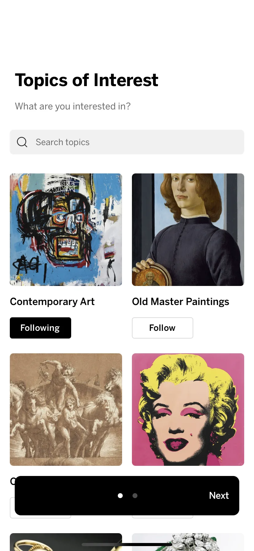
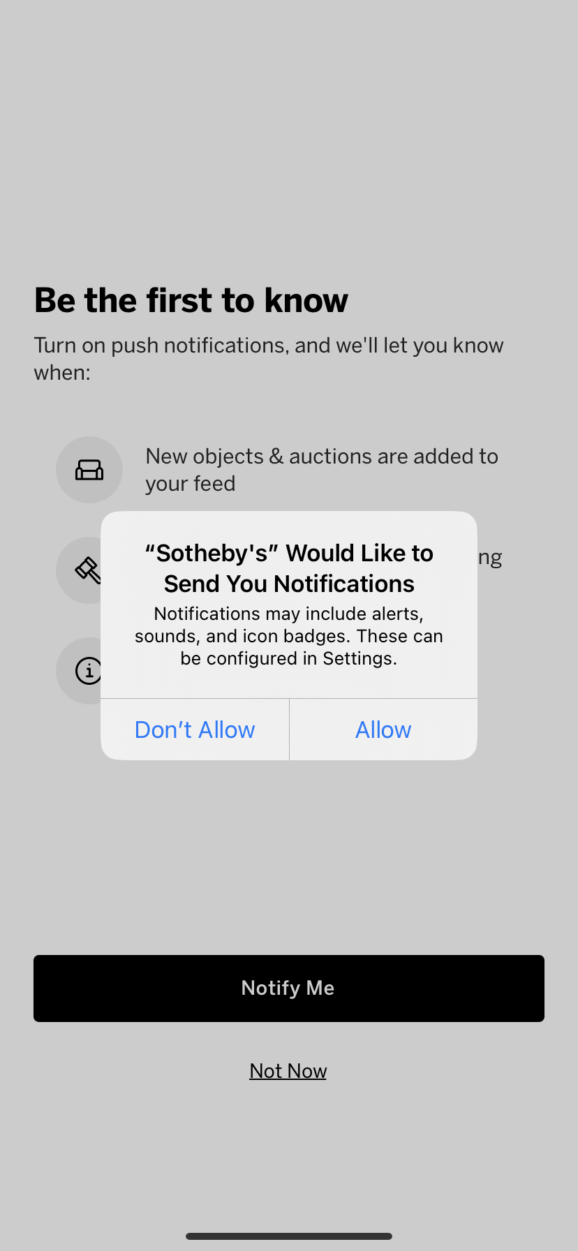
Newcomers told us which kinds of art and objects they collected, and that shaped their entire experience.

How we evolved
When I joined Sotheby’s, the mobile apps crashed often and nobody could tell why or how to fix them. Opening them took between 4 and 10 seconds, which was incredibly painful when an auction was seconds from closing. And checking on users’ bids meant digging through several screens and wasted time and lost art. We fixed it all.
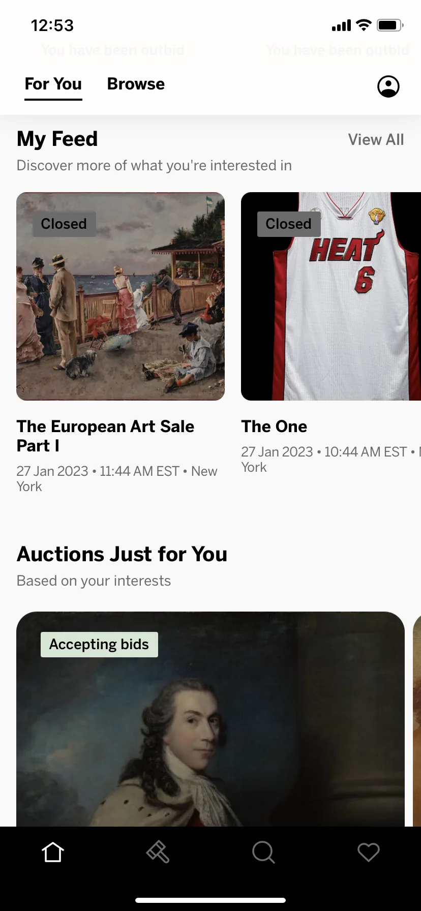
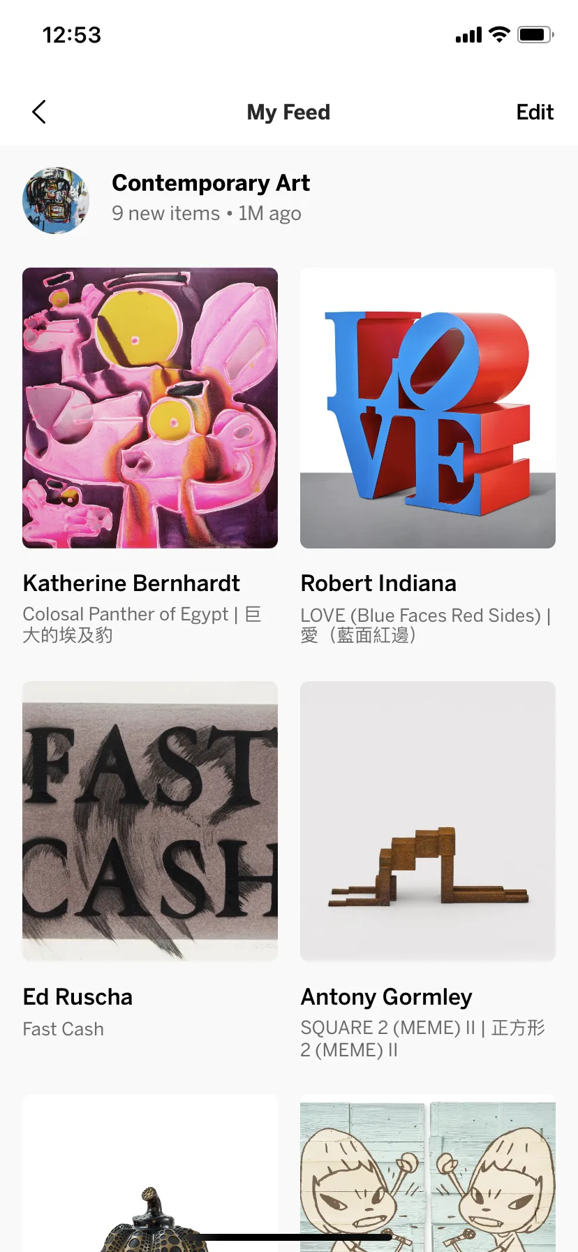
Buyers told us they were tired of hunting in the app for both new items that matched their taste, and also auctions they were already participating in. So the moment they signed up, we asked them to pick the kinds of pieces they collected. Their answers built a home feed of items chosen specifically for them, and every week an alert pointed them to new arrivals. When something caught their eye and they started bidding, it stayed front and center on the home screen, so they always knew whether they were winning.
One survey response summed it up: “This is the best app of all auction houses.”
For collectors and bidders
Newcomers told us which kinds of art and objects they collected, and that shaped their entire experience.
We picked fresh items for each person, based on their interests and what they’d browsed or bid on.
Results: 67% of users engaged and weekly retention rose 24%.
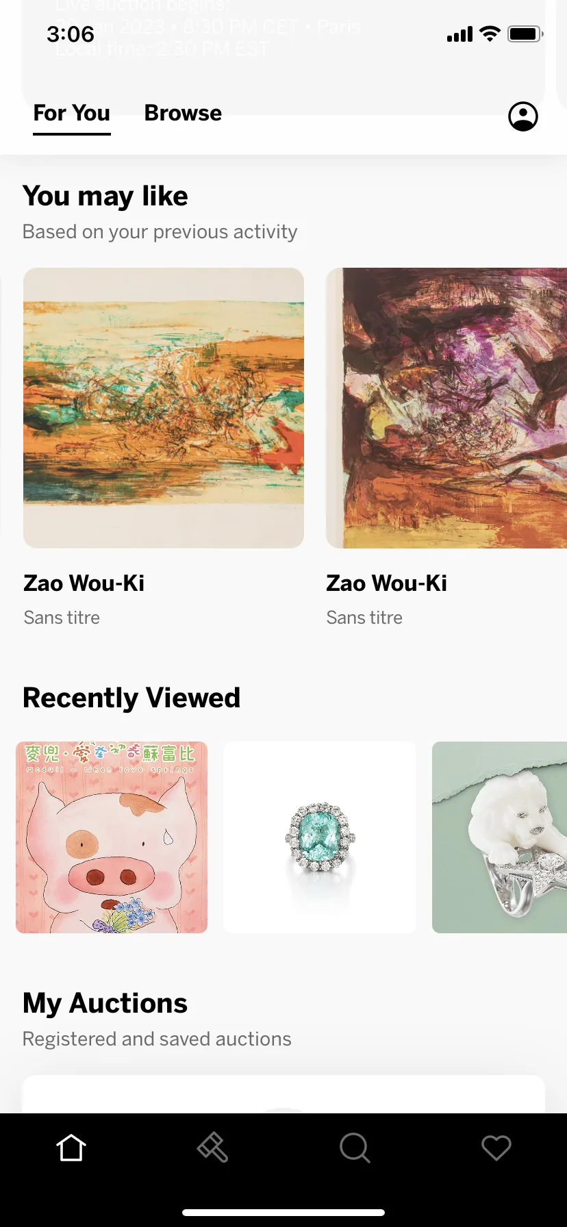
Nobody wanted to hunt for pieces that matched their taste, so we started sending alerts every Friday.
Results: 12% more daily visitors on Fridays and 8% more items viewed per session.
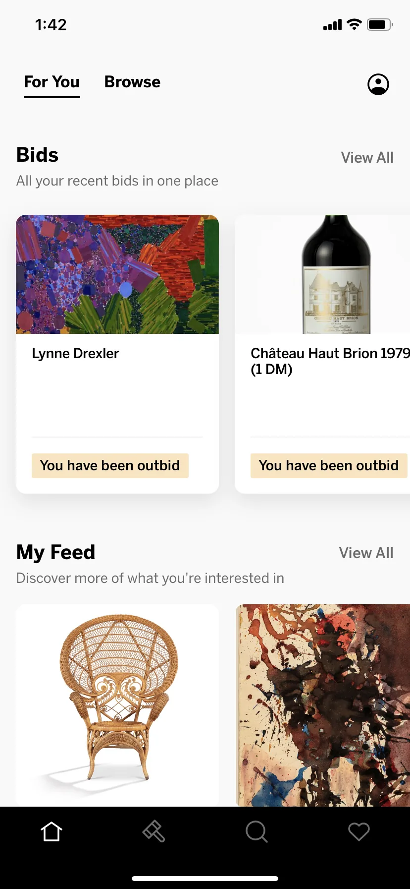
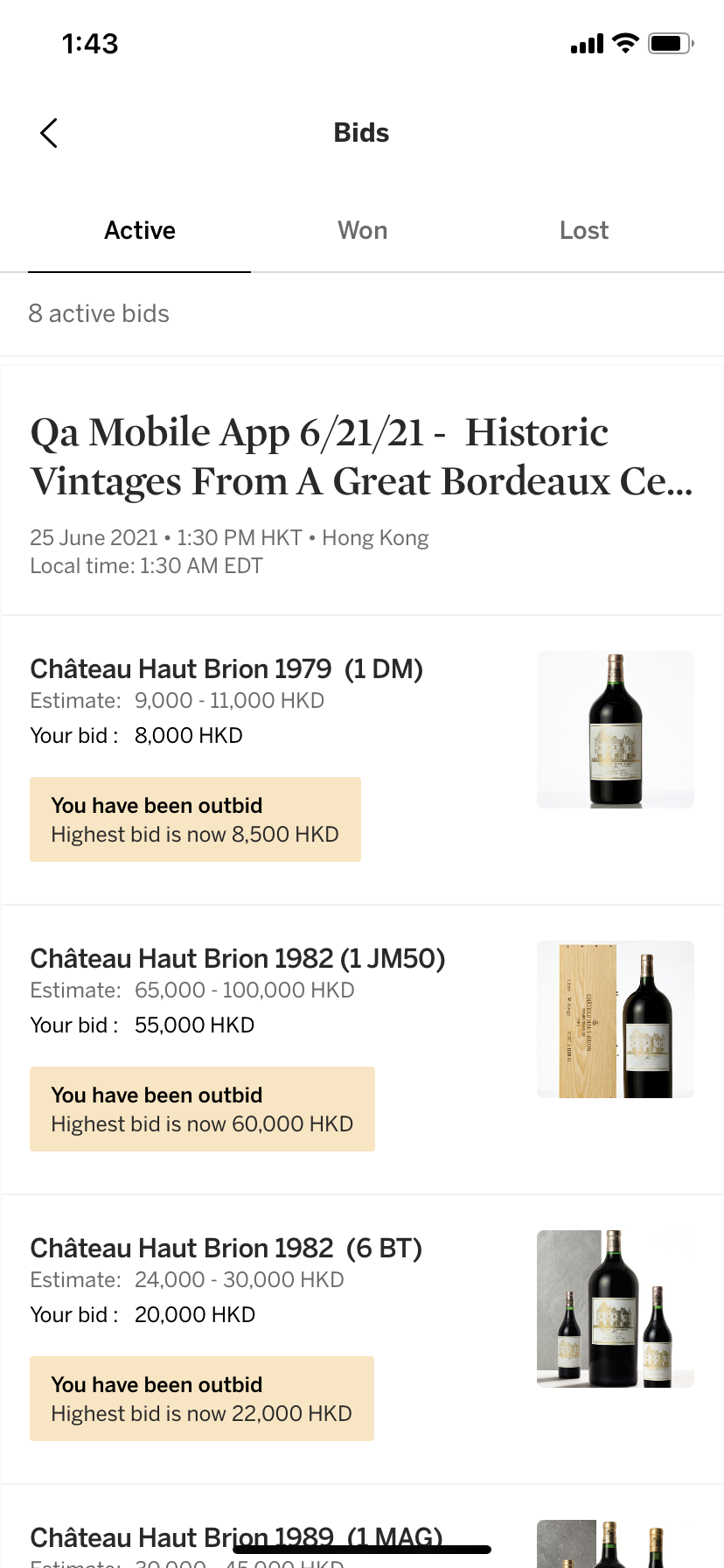
Active bids were hard to find. We moved them front and center, so buyers never missed being outbid.
Result: 4 seconds faster to place a bid.
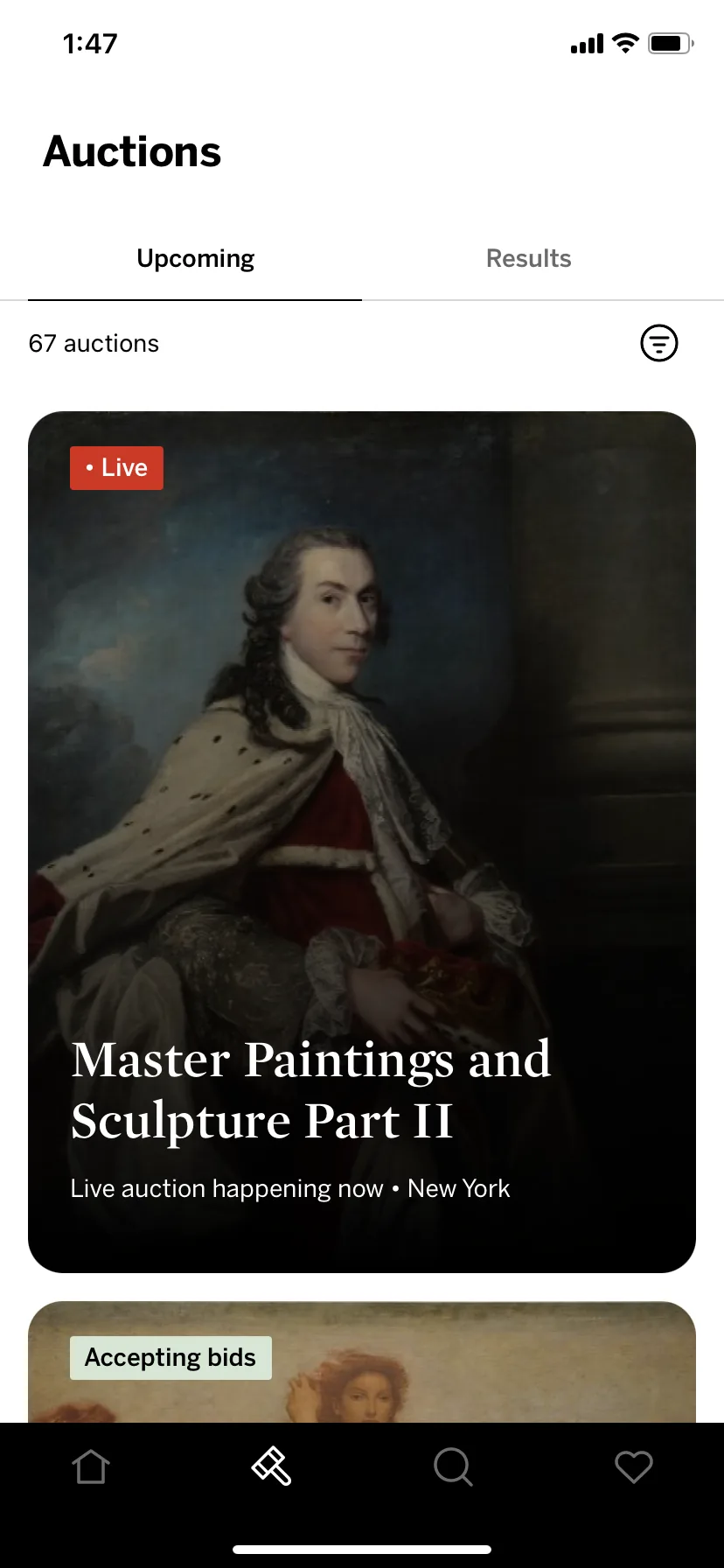
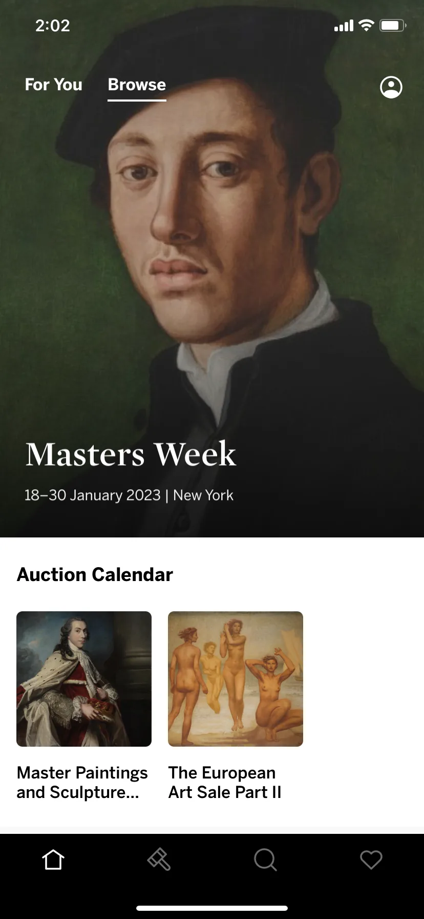
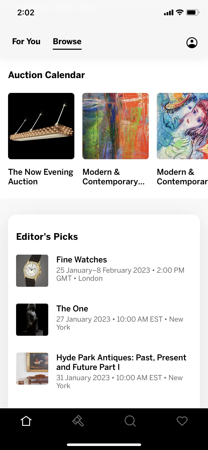
We added bigger images, local times and filters to the calendar, making it easier to discover new auctions.
Result: a 33% lift in conversion from calendar to auction.
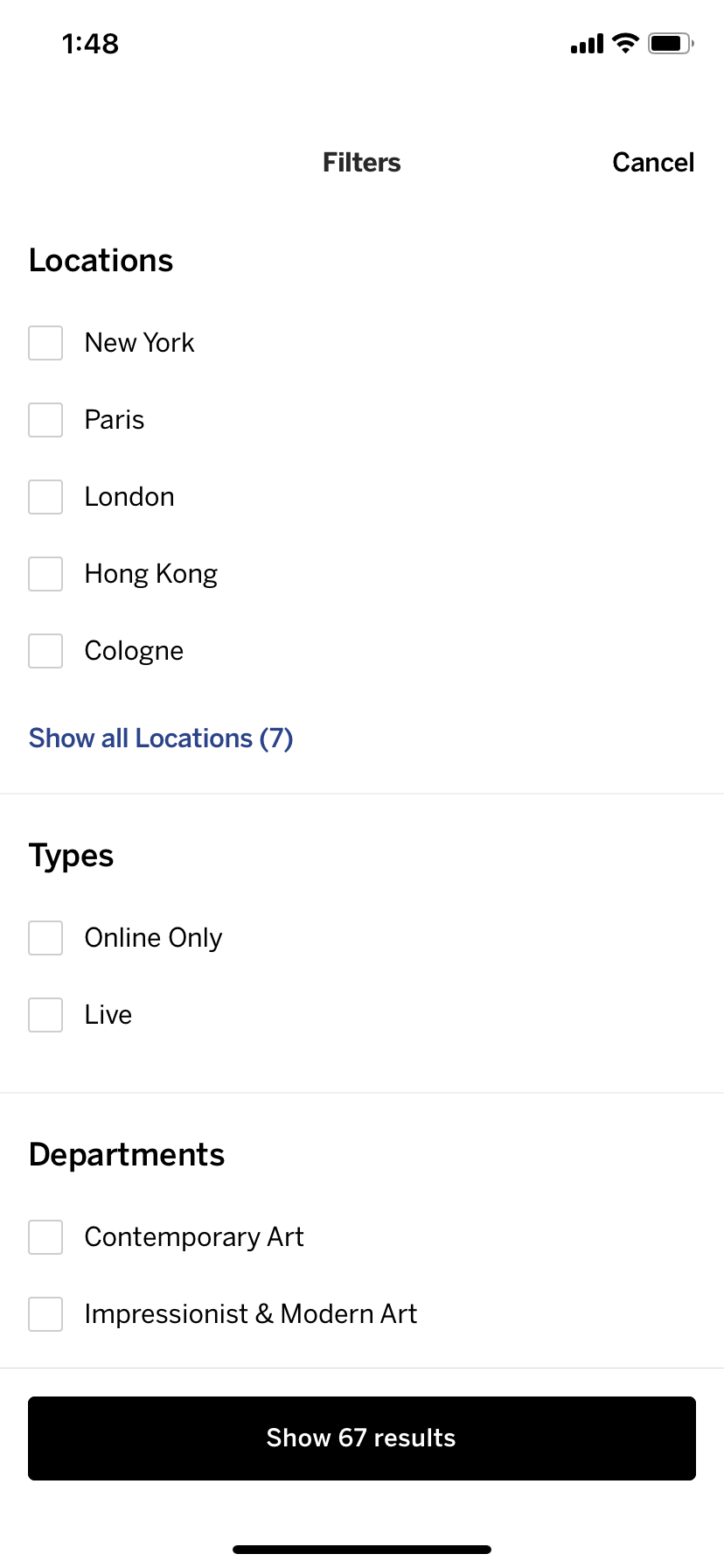
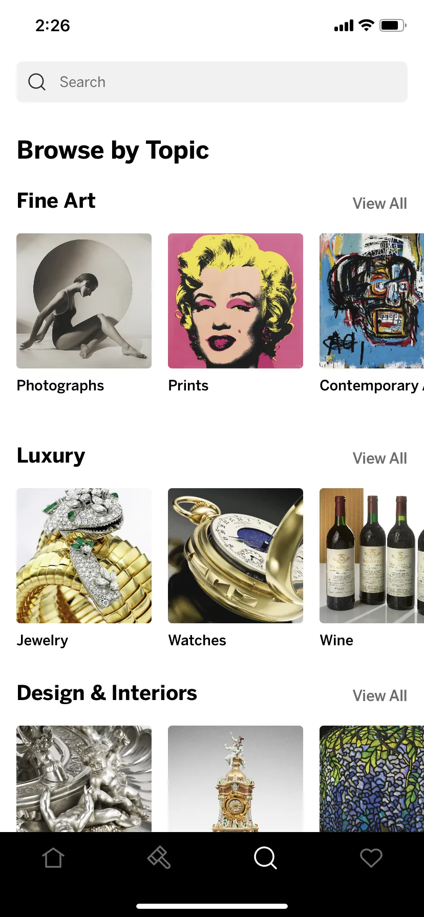
Marketing needed to promote auctions and objects on their own schedule, so we built sections their team could arrange themselves, based on how our users searched for objects.
Result: 7% more items viewed per user per session.
Behind the scenes
We asked them what they needed, and their answers shaped what we built.
We built a system that learned each person’s taste from their sign-up picks and what they browsed and bid on, then put it to work in their home feed and weekly alerts.
We replaced our old bug tracker with Sentry, so we could see where and why crashes happened and fix problems before users reported them.
The apps checked for updates on the opening screen, which slowed every launch. We moved that check to the background, and load time dropped from 4–10 seconds to about 2.5.
We added Mixpanel to track what people actually did in the apps, and Optimizely to run A/B tests. Until then, nobody had studied that behavior.
Two years later