
Designing for a mass market
Reserve was a B2B2C platform created to help restauranteurs succeed in the notoriously difficult, low-margin market. We started by offering restauranteurs an easy way to capture reservations and manage their in-service operations in the NYC market. But as the company expanded, the restaurants (and therefore, diners) became more diverse, and our products needed to undergo a massive change.
We set out to build a new experience for mobile and web that supported all restaurants and diners, which resulted in a 30% increase in reservations per day, a 40% increase in restaurant subscriptions, and partnerships formed with Google, Facebook, and Expedia.
Responsive Web
iOS
User Interviews
Sketch Sessions
Prototyping
User Experience Testing
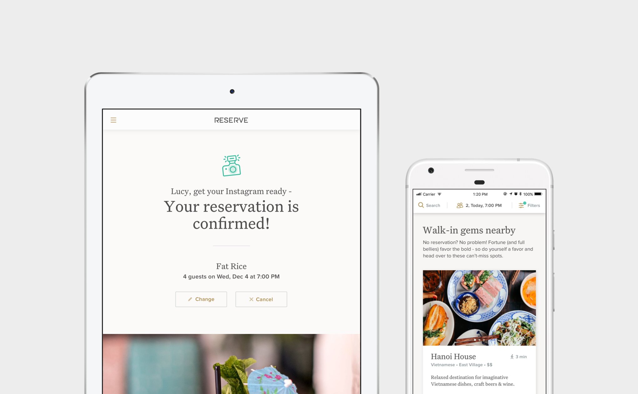
Email Confirmations
Tyopgraphy
Responsive Web iOS User Interviews Sketch Sessions Prototyping User Experience Testing Email Confirmations Tyopgraphy
Keywords
User Interviews
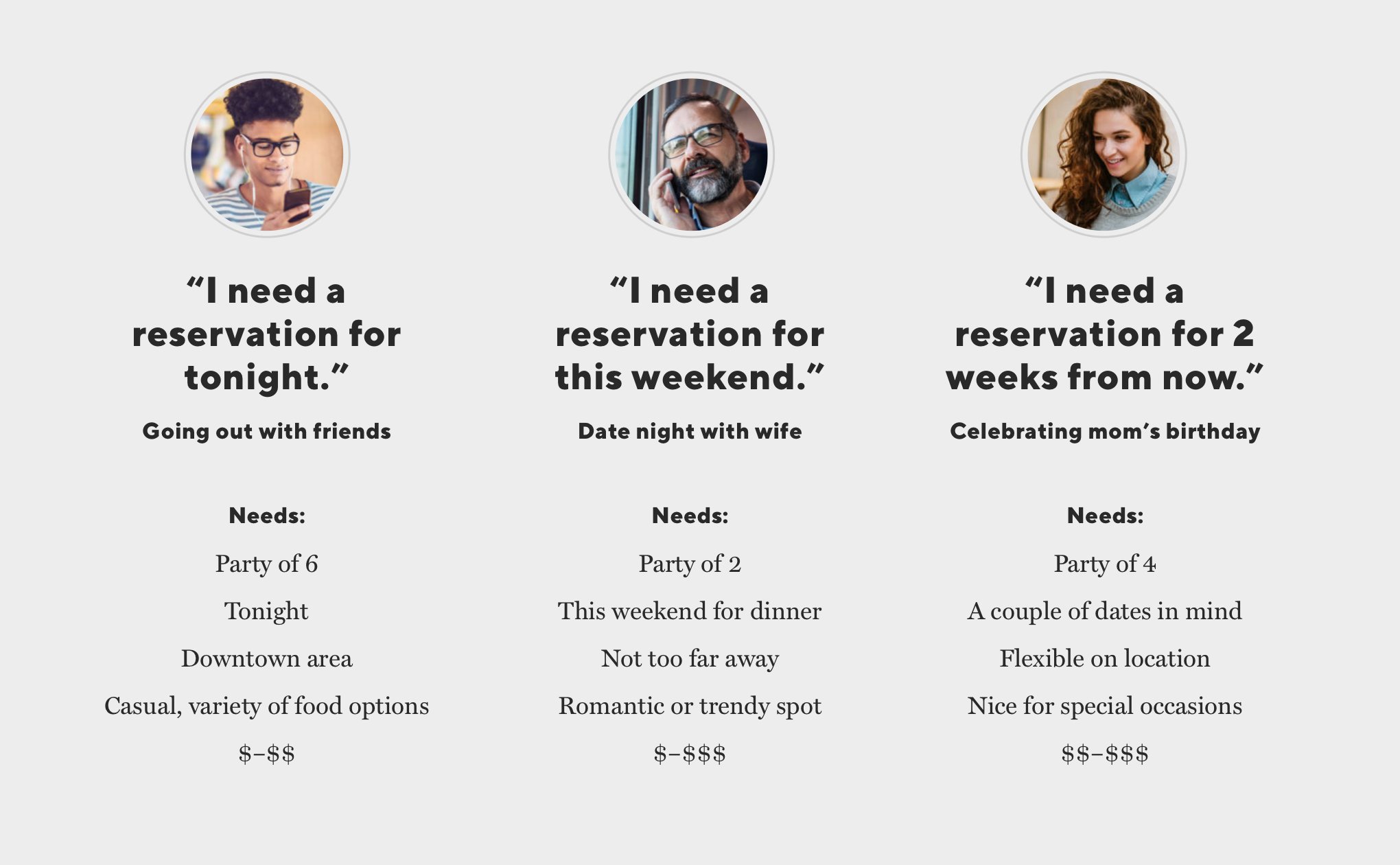
To better understand the end-to-end dining experience, we asked diners to show us how they find a restaurant and make a reservation. We were interested in them showing us rather than telling us so we could see exactly what they did and where they encountered frustration.
The process

We quickly realized that the current Reserve experience didn’t address many of these steps.
We also noticed users’ reservation needs (a certain or uncertain date, time, location, vibe, and price) differed depending on who they were dining with and the occasion for dining. We took note of these needs to address throughout the design process.
Perhaps the most important takeaway was the sheer excitement people felt when they were able to make a reservation at a restaurant they really wanted to go to “Oh yay! I got in.”
This emotion shifted our perspective–instead of looking at the Reserve journey as a transactional experience, we started looking at it as a truly enjoyable and human experience from beginning to end.
Perhaps the most important takeaway was the sheer excitement people felt when they were able to make a reservation at a restaurant they really wanted to go to: “Oh yay! I got in.”
This emotion shifted our perspective–instead of looking at the Reserve journey as a transactional experience, we started looking at it as a truly enjoyable and human experience from beginning to end.
Our North Star
We noticed a significant theme in our conversations. People continually mentioned relying on word of mouth from family, friends, and food blogs as the most important factor in deciding on a restaurant, so we decided to embody this and become our users’ “go-to, trustworthy friend.”
Our designers looked at brands that we trusted–like Casper, Google flights, Slack, and more - to see how they achieved a sense of trust. They noticed details like tidbits of helpful information at key moments, strong typography with a clear action or message, and a bit of humor here and there to help the user feel at home.
This would serve as inspiration for the new experience.
Design Iteration
We first focused on the home page and restaurant detail page, since that’s where users spend the most time and make decisions that impact the rest of their experience.
For these pages, we enlisted small groups of people from different areas of the company to do sketch sessions. Our goal was to get as many ideas down as possible.

Many ideas came out of the sketch sessions, such as Mad Libs (to learn what the user is looking for) and social media photos (to get a feeling for a restaurant from other diners).
Low-Fidelity Prototypes
Our designers took the ideas that resonated the most and converted them into wireframes to test with actual users.
We showed prototypes to users of a variety of ages, locations, and dining habits. When in-person conversations were not possible, we used Lookback to conduct the tests.
A realization
Something we discovered early on was the importance of including actual restaurant images in the prototypes rather than gray boxes. This showed us how critical the images were in helping a user decide to make a reservation (or not).

After adding images to the prototypes, we quickly realized the not-so-good photos (and, therefore, the restaurants) were entirely skipped over during the user tests, even for restaurants that were award-winning and highly recommended.
We knew it wasn’t feasible for restaurants to have the budget for professional photography, but their photos were actually doing them a disservice - especially when they served as a user’s first impression, like on the home page.
To solve this, our team scoured Instagram and Google to find images that were more appetizing and inviting. Even a small handful of good images made a huge difference!
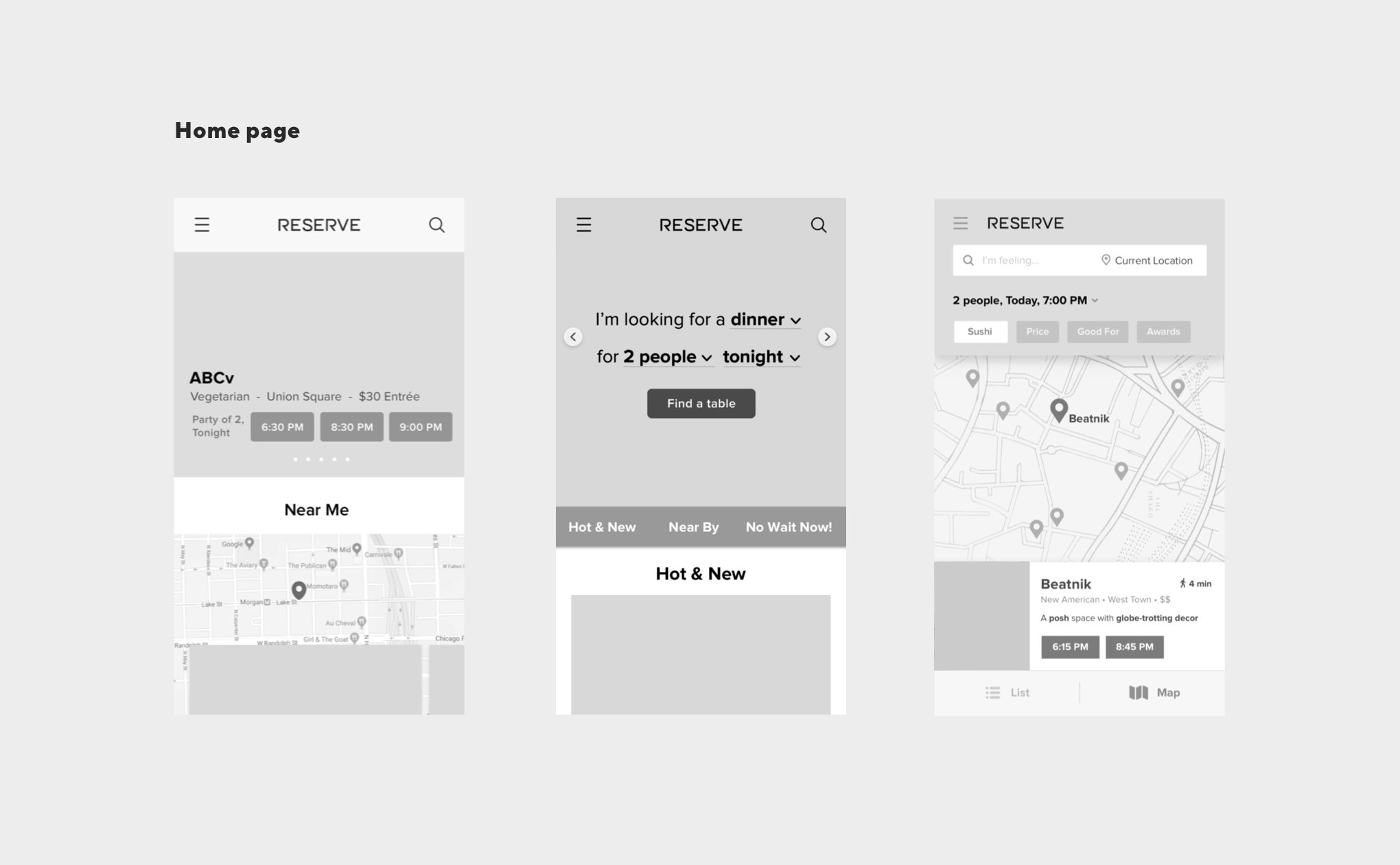
Home page findings
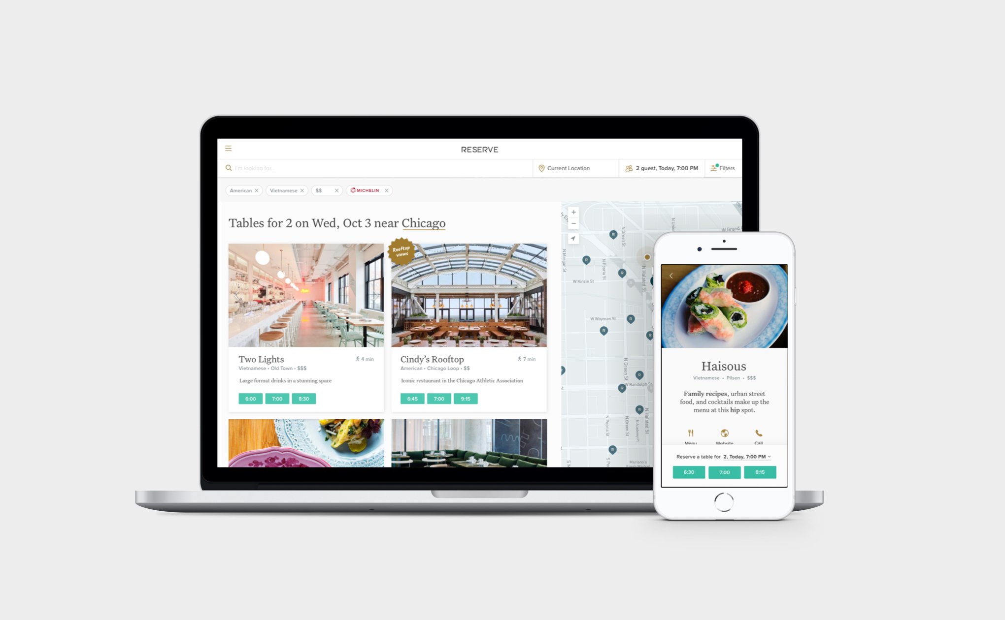
Users loved the curated lists like ‘Neighborhood gems’ and badges on the restaurant cards. It was unanimous that an interior shot was preferred for the default restaurant image to get a sense of the vibe right off the bat.
Users also loved the “Restaurants I’ve looked at” list. This idea came to us when we heard people might look at more than 10 restaurants before finally deciding.

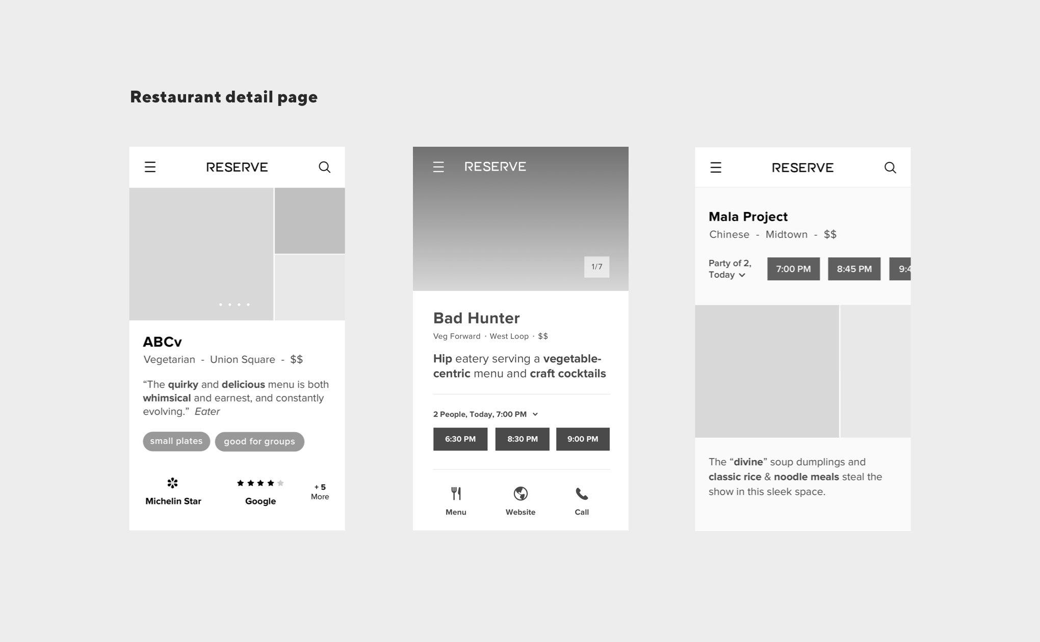
Restaurant Detail Page Findings
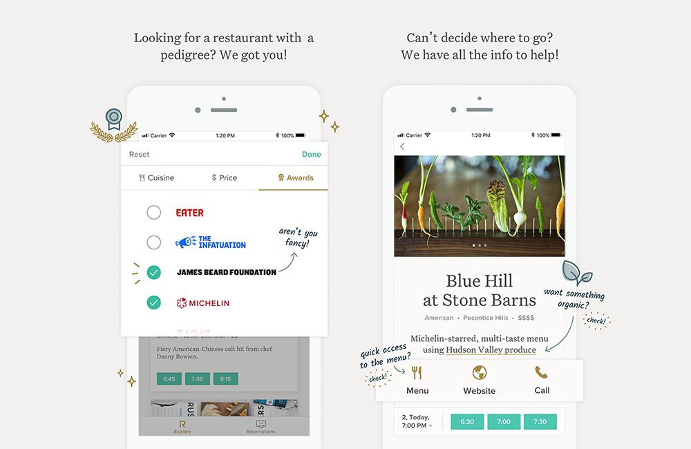
Users loved easy access to interior and food images as well as the awards displayed front and center. They also responded well to the personable feeling of the content being written from the restaurant’s perspective, including who the chef is and their claim-to-fame.
Quick access to the restaurant’s contact, menu, and website were deemed important as well, especially on the phone.

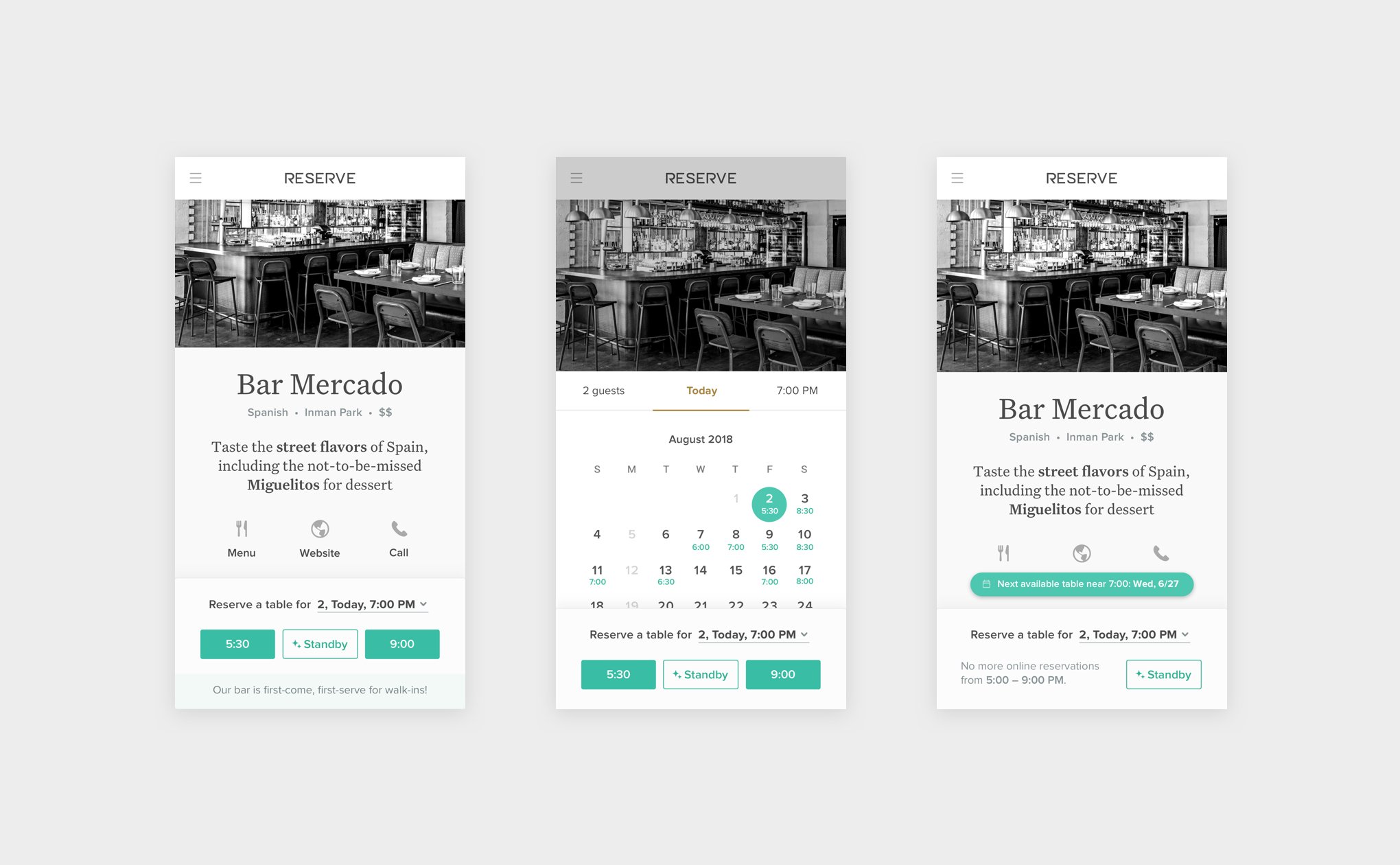
Eliminating dead ends
We also took users through the scenario of not being able to find a reservation for a restaurant they want to go to. While the old experience resulted in a dead end, in our prototypes, we showed them a variety of alternatives
Users preferred seeing more options at the same restaurant first (such as other dates and times available, walk-in information, or being able to add themselves to a waitlist) and then seeing similar restaurants in the same area with reservations available.
These different choices will give users the best chance to find the reservation they want, even as their needs change from one dining occasion to another.

Building on our theme
Continuing with the theme of trust, we added tidbits of helpful information at key moments, strong typography with a clear action or message, and a bit of humor here and there to help the user feel at home.
Visual style
The restaurant content paved the way for the visual style. Beautiful images, large and small type, and plenty of white space invites users in to experience each restaurant. By keeping the restaurant as the hero, the interface worked well for our wide variety of restaurants, from the casual neighborhood spots to the Michelin-starred.
We chose Untitled Serif for its credible yet approachable feel, and Proxima Nova for accents.
Having a bit of fun
We decided to have some fun with the copy, especially for the moments that called for a celebration.
A few more tests, just to be sure
We performed another short series of user experience tests to make sure we got things right and began to build.
The importance of engineers and QA
While not explicitly called out, our engineers & QA team members were integral to the entire process and were included in all phases of discovery and iteration. They are critical, not just to give feedback on technical implications, but to provide ideas as well throughout the process.
Results
Impact on Restaurants and Diners
The launch of the consumer experience had a significantly positive impact on not only our diners but our restaurants as well; the redesign resulted in a 30% increase in reservations per day. Restaurants took notice, which helped sign 40% more subscriptions for our restaurant-facing product.
Other companies took notice
Google and Facebook both asked us to be one of the founding companies to integrate reservations into their platforms.
Expedia asked us to white-label our site.
I led all three projects.
A few quotes from our users
“The simplicity makes finding a restaurant so easy.”
“All the best restaurants near me use Reserve. I have such a good experience every time!”
“Thank you for making our anniversary one we’ll never forget.”